

What do Tottenham’s double winning team of 1961, the England 1966 and Brazil 1970 world champions and Liverpool’s early European Cup winning sides have in common? All of them sported kits manufactured by Umbro. The renowned British company can be proud that the elegantly classic strips they supplied to these seminal teams remain popular purchases in the burgeoning retro market to this day.
But really, back in the 1960s and 70s while Umbro may have had a good commercial eye, there was little coming out of the company’s design department that was in any way bold or dynamic. Not that this was at all an issue in an era when regulatory restrictions kept sponsors and logos at bay and ensured kits by all manufacturers at all levels of the game were invariably plain and simple affairs – whether Brazil or the Blue Brazil of Cowdenbeath. Typically shirts, shorts and socks featured little more in the way of adornment than single slabs of colour.

Commercialism took hold in the 1970s and ensured that many aspects of the game, including shirt design, would never be the same again. One positive byproduct to emerge was the arrival of new challengers into the shirt manufacturing arena, each armed with progressive ideas and quirky design cues that advanced standards. Football fans swooned at the effortless cool of Kappa, the stylish brio of Le Coq Sportif and the exuberant riot of colourful excess that typified every Admiral creation. Now in a world where shirt manufacturer designers were let off the leash and allowed to innovate wildly, Umbro’s unremarkable trademark double diamond design started to look rather prosaic and frayed around the edges (metaphorically rather than literally).
The 1980s did see Umbro up the ante and create shirts based around a bolder design language, but the company still could never quite cast off their reputation for staid design. Flamboyance and frippery were words that didn’t exist in the Umbro creative lexicon. The firm’s cause was not helped by the many middle-of-the-road clubs like Dundee, Watford and Sheffield United which comprised Umbro’s humdrum 1980s roster and didn’t exactly provide the most glamorous of canvasses for their creations; indeed once Liverpool decamped to Adidas in 1985, an Umbro logo would not be sported by another champion in the European Cup era.
Shirt design history lesson over and it’s worth mentioning that despite my reservations about Umbro design, there remains a residual well of fondness for the brand from my childhood. Glasgow was Umbro town as they supplied the big trio of Rangers, Celtic and the Scotland national team. Anyway, I got to thinking about how some of the most beautiful and stylish shirts of the modern era might have looked had those Umbro designers from the past got their hands on them. So who better to turn to than shirt design guru Denis Hurley from the excellent Museum Of Jerseys site in order to bring this Frankenstein’s monster of an idea to life.
I proposed a list of ten historically non-Umbro affiliated kits and Denis obliged by developing new versions, ones that are reimagined using different key Umbro design elements from the 70s and 80s. Denis’s eye for this sort of thing is as strong as ever and the results are fascinating – even if in most cases you would stick with the striking originals.
We hand over to Denis now as he talks us through the influences behind his designs. Click any of the strips to enlarge.

Barcelona (a): I do have a fondness for these styles – it’s probably a comfort thing, a warm blanket you can wrap around yourself. Umbro hit upon an idea they liked – two coloured bars – and transposed that all over their mid-80s shirts. Barca had yellow shirts with a blaugrana sash in the 70s and this look is modified here, using a template Oxford United had on their away kit.

Fiorentina: La viola had a beautiful Ennerre kit with a white hoop in the 80s, but as Umbro didn’t have any shirt with that look, I appropriated the Scotland World Cup 1986 style, which had banded shorts.

Dukla Prague: Not the away kit that Half-Man Half-Biscuit sang about, but instead the more conventional home layout. A slight cheat in that Umbro didn’t give it to any team with just contrasting sleeves – the Leeds away and similar Celtic away had the upper body in the same colour as the sleeves.

New York Cosmos (a): Not a million miles from Dukla, but with asymmetrical panels, used by Sheffield United for their away kit. In the NASL heyday of the 1970s, the Cosmos’ kits were actually fairly restrained for the most part.
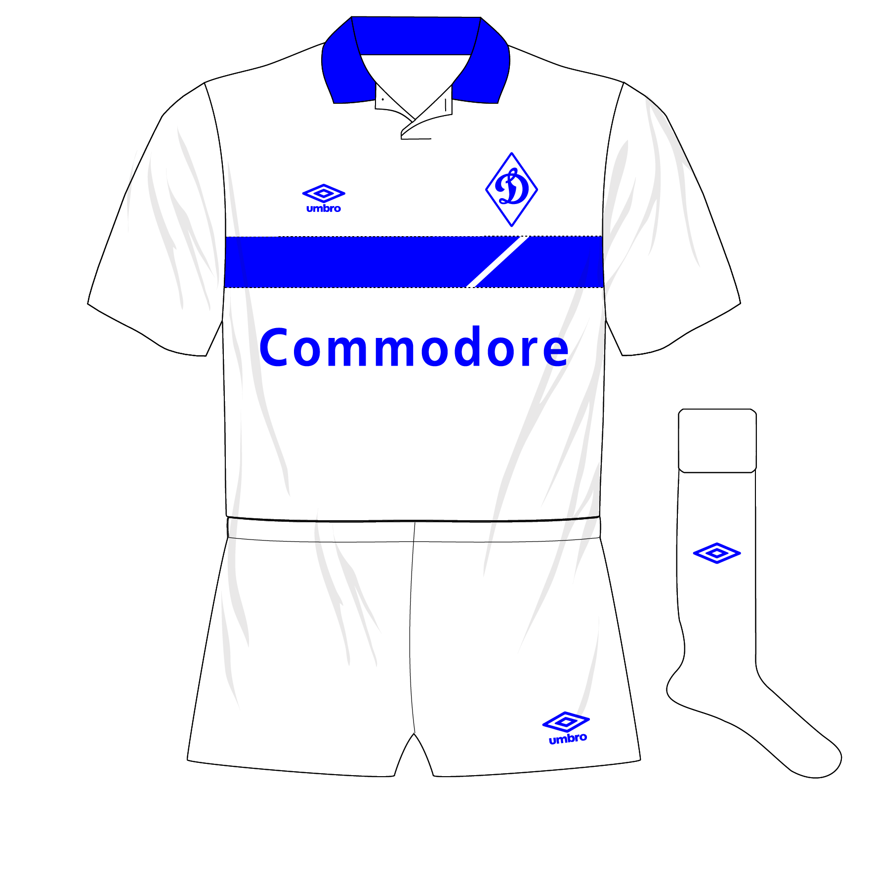
Dynamo Kiev: Perhaps not the best choice for this design as the horizontal bar was best with two different colours, with Watford my favourite example. Using Dynamo also invites accusations of plagiarism of the Rangers away.

Ajax: Another ‘two stripe’ style in the same colour, but this does mirror reality as on the Portsmouth away. Given that Ajax fans were up in arms the first time Adidas tried to put their three-stripes mark on the kit in 2000, we’re not sure if this would have been well-received. When Umbro did take over in the late 80s, they kept things fairly simple.

Borussia Mönchengladbach: Some artistic licence – closest referencing is the Newcastle v-neck home with just the three stripes, aping Moenchengladbach’s classic 70s look. It’s a bit disappointing that the club haven’t revisited what it is a great-looking style in recent times, especially as it’s so uncommon.
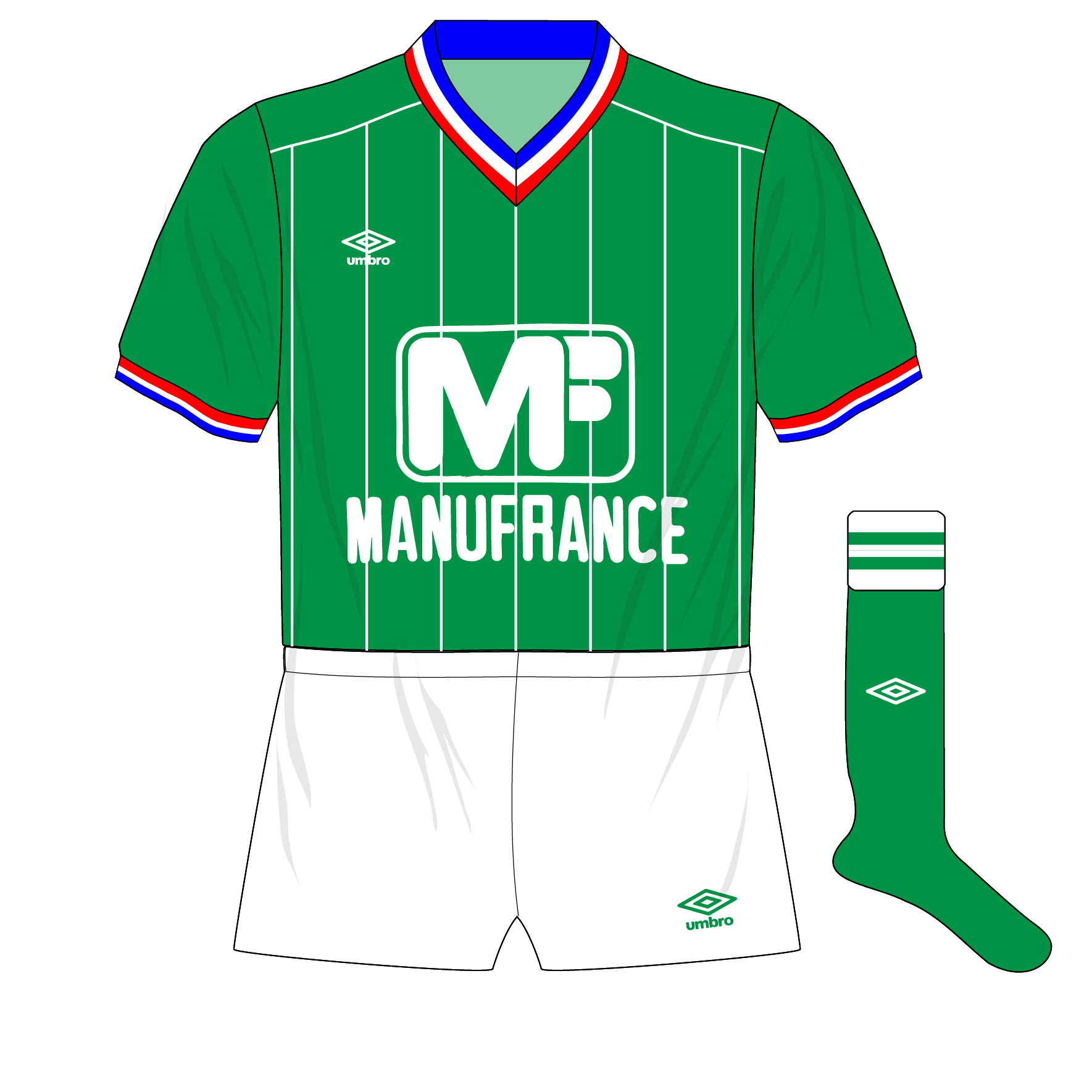
Saint-Etienne: Perhaps my favourite as the use of the Liverpool 82-85 design allows a nod towards St-Etienne’s classic Le Coq Sportif kit, and the neck allows for easy modification to replicate the ‘tricolore’.

Vasco da Gama: More freestyling – full sashes weren’t in the Umbro artbox but a Vasco kit couldn’t not have one. The solution is to take Umbro’s famous shadow striping and rotate it to match the sash.

Karl Marx Stadt: I must admit, to my shame I wasn’t really aware of this until Craig pointed me in its direction. Doing too much would unbalance what is a classic, so the only accoutrements are the subtle pinstripes, as seen on the Arsenal home.

